Container
A container lays out child elements. It is the general-purpose building block: buttons, cards, rows and toolbars are all containers with styles and handlers.
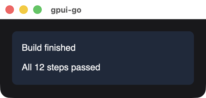
card := scene.Div(1,
	scene.Text(2, "Build finished"),
	scene.Text(3, "All 12 steps passed"),
).Style(&scene.Style{
	FlexDirection: scene.FlexColumn.Enum(),
	Gap:           scene.Pixels(8),
	Padding:       scene.Padding(16),
	Background:    scene.RGB(0x1e293b),
	CornerRadius:  scene.Ptr[float32](8),
})
Signature
func Div(id uint64, children ...*Node) *Node| Parameter | Description |
|---|---|
id | Stable nonzero element ID |
children | Child nodes, in paint and layout order. Each is copied. A nil child panics |
Layout
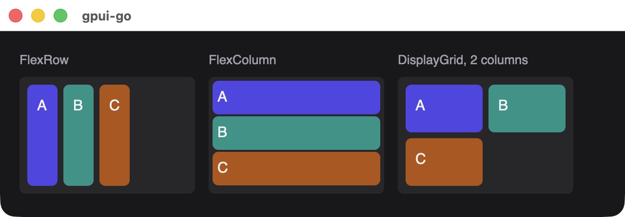
Setting FlexDirection makes the container a flex container. Use FlexRow for a row and FlexColumn for a column, then AlignItems, JustifyContent, Gap and FlexWrap to arrange the children. For a grid, set Display to scene.DisplayGrid and GridColumns to the column count, and leave FlexDirection unset. See Style properties.
Children can scroll when you set OverflowX or OverflowY to scene.OverflowScroll. Scroll position is native state that survives new snapshots while the container's ID stays the same.
Making a button
There is no dedicated button element. Compose one from a container so you control its appearance:
button := scene.Div(10, scene.Text(11, "Save")).
	Style(&scene.Style{
		Padding:      scene.Padding(10),
		Background:   scene.RGB(0x4f46e5),
		CornerRadius: scene.Ptr[float32](6),
		Cursor:       scene.CursorPointer.Enum(),
	}).
	Hover(&scene.Style{Background: scene.RGB(0x6366f1)}).
	Focusable(0).
	Accessible("Save", &scene.Accessibility{Role: scene.RoleButton}).
	OnClick(handler)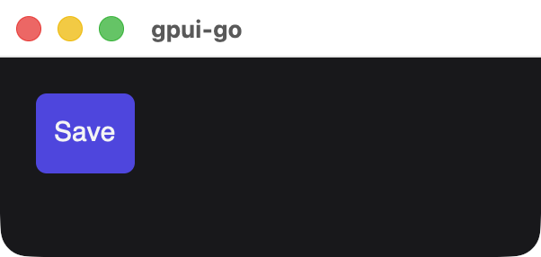
Hover runs in Rust, with no Go event or new snapshot. A focused element with a click handler can also be activated from the keyboard.
Available in other APIs
ui:Document.Div, which also supports reassigning children withSetChildrenandAppend.- GoX: the
div,span,textandbuttontags.